I have incorported lots of drawers of varying sizes as I think storing stuff, and more importantly, retrieving stuff from, drawers is so much easier than poking around in the back of cupboards. I also chose to do away with "eye-level" units. Kitchen designers please note: they are not eye-level to those of us not 6' tall! I will never bother with these ridiculous, clutter gathering, sky-level units again having taken them out of our own kitchen at home a couple of years ago and finding how much better it is to have everything handy as opposed to having to find a chair to perch on to reach stuff at the back of "eye level" units!
The dishwasher and the fridge/freezer are both shiney black and will complete the vanilla/black theme.
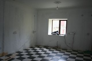
These pics show 3 stages of reaching (nearly) the end result (doncha love before and after pics?!).


.JPG)
I had been worrying that perhaps the 2 tables and 12 kitchen chairs I bought for the dining area might be too big. Yes, I had measured and was almost sure but when the kitchen was full of boxes and debris from the fittings it was hard to imagine. Yesterday we cleared all the debris out and I took this pic from the diner window end of the room. The old pine table to the left of the pic is quite large and though the 2 tables which will replace it are a bit longer, I think there will still be lots of space of comfortable dining. And certainly either side of the table and chairs has lots of space for ease getting into and up from a seat.

To the left of the diner end window (no pic) there is an inverted area into which I have been going to have a cupboard fitted. However, when we moved the antique glass cabinet to the place I had been going to put it (against one of the diner walls at the side), it just looked wrong. My husband had the idea to try it in the space where the fitted unit was to go. It fitted perfectly! So now the glass cabinet will sit in there and I can fill it with lots of little knick-knacks! Perfect!
We had one of our sons with us to help with all the shifting about and he pointed out that the house and furnishings were going to be at the least electic. And he's right, but as I love electic that made me happy.
And speaking of eclectic ... into this country style kitchen with it's antique cabinet, I think I found the perfect lights. I really don't go for those strip lights in the kitchen area and as our ceiling is a little higher than the norm, they would probably be wasted anyway. So, on Saturday when I was searching for a suitable tap (more decisions) I happened to wander into a lighting place, as you do, and I saw these glass light shades with a definate 1950s flavour. I just loved them and I think I will go for them for both the kitchen and dining area.
What to put on the walls? I found some tin 'coke' signs my husband had bought some time back and of course I will use them. But there's lots of wall and I would like to have something on the walls of the dining area. I thought last night that I might try to take a range of food photos and have them framed. I am thinking single fruit or veg in bright colours and maybe mounted on canvas (I'm starting to sound like some frilly sleeved interior designer!). I will have to work on that but in the meantime i think it would fit me better to go off now and ring to arrange delivery of our fridge/freezer and dishwasher!

No comments:
Post a Comment